
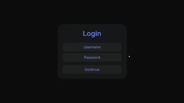
效果演示
文末可一键复制完整代码
Code
HTML
<!DOCTYPE html> <html> <head> <meta charset="UTF-8"> <meta name="viewport" content="width=device-width, initial-scale=1.0"> <title>高级感登录页</title> <link rel="stylesheet" href="./120-高级感登录页.css"> <script src="https://cdnjs.cloudflare.com/ajax/libs/gsap/3.9.1/gsap.min.js"></script> </head> <body> <div> <div>Login</div> <div> <input type="text" placeholder=""> <div>Username</div> </div> <div> <input type="text" placeholder=""> <div>Password</div> </div> <div>Continue</div> </div> </body> </html>
CSS
@import url('https://fonts.googleapis.com/css2?family=Inter:wght@400;500;600;700&display=swap'); *, *:before, *:after { -webkit-box-sizing: border-box; -moz-box-sizing: border-box; box-sizing: border-box; } body { margin: 0; height: 100vh; width: 100%; color: black; background: #0c0c0b; overflow: hidden; display: grid; place-content: center; } .login { background: #151617; width: 20rem; padding: 1.5rem; border-radius: 1.5rem; display: grid; gap: 0.5rem; } .logintext { font-family: "Inter"; color: #6779f5; text-align: center; font-size: 2rem; font-weight: 600; margin-bottom: 1rem; } @property --anim { syntax: "<number>"; inherits: true; initial-value: 0; } .field { background: #6779f5; border-radius: 0.75rem; position: relative; height: 2.5rem; --anim: 0; transition: --anim 500ms ease; background: linear-gradient(to right, #6779f5 calc(clamp(0, (var(--anim) - 0.75) / 0.25, 1) * 33%), transparent calc(clamp(0, (var(--anim) - 0.75) / 0.25, 1) * 33%), transparent calc(100% - clamp(0, (var(--anim) - 0.75) / 0.25, 1) * 33%), #6779f5 calc(100% - clamp(0, (var(--anim) - 0.75) / 0.25, 1) * 33%)), linear-gradient(to top, transparent calc(15% + clamp(0, (var(--anim) - 0.65) / 0.1, 1) * 70%), #202122 calc(15% + clamp(0, (var(--anim) - 0.65) / 0.1, 1) * 70%)), linear-gradient(to right, transparent calc(50% - clamp(0, var(--anim) / 0.65, 1) * 50%), #6779f5 calc(50% - clamp(0, var(--anim) / 0.65, 1) * 50%), #6779f5 calc(50% + clamp(0, var(--anim) / 0.65, 1) * 50%), transparent calc(50% + clamp(0, var(--anim) / 0.65, 1) * 50%)), linear-gradient(#202122, #202122); } .field:has(input:focus) { --anim: 1; } .field>.placeholder { pointer-events: none; position: absolute; inset: 0; display: grid; place-content: center; color: #7d8dff; font-family: "Inter"; transition: transform 500ms ease; } .field:has(input:focus)>.placeholder, .field:has(input:not(:placeholder-shown))>.placeholder { transform: translateY(-50%) scale(0.85) } .field>input { display: flex; align-items: center; padding-left: 1rem; color: white; position: absolute; inset: 0.125rem; border-radius: 0.625rem; border: none; outline: none; background: #202122 } .loginbtn { margin-top: 0.5rem; background: radial-gradient(circle at center, #6779f5 calc(-50% + var(--anim) * 150%), #202122 calc(var(--anim) * 100%)); border-radius: 0.75rem; position: relative; height: 2.5rem; display: grid; place-content: center; color: #7d8dff; font-family: "Inter"; --anim: 0; transition: --anim 500ms ease, color 500ms ease; } .loginbtn:hover { --anim: 1; color: white; cursor: pointer; }实现思路拆分
@import url('https://fonts.googleapis.com/css2?family=Inter:wght@400;500;600;700&display=swap');引入Google字体“Inter”。
*, *:before, *:after { -webkit-box-sizing: border-box; -moz-box-sizing: border-box; box-sizing: border-box; }设置全局盒模型。
body { margin: 0; height: 100vh; width: 100%; color: black; background: #0c0c0b; overflow: hidden; display: grid; place-content: center; }设置页面样式,包括背景颜色、居中显示等。
.login { background: #151617; width: 20rem; padding: 1.5rem; border-radius: 1.5rem; display: grid; gap: 0.5rem; }定义登录表单的样式。
.logintext { font-family: "Inter"; color: #6779f5; text-align: center; font-size: 2rem; font-weight: 600; margin-bottom: 1rem; }定义登录文本的样式。
@property --anim { syntax: "<number>"; inherits: true; initial-value: 0; }定义CSS自定义属性。
.field { background: #6779f5; border-radius: 0.75rem; position: relative; height: 2.5rem; --anim: 0; transition: --anim 500ms ease; /* 渐变背景 */ }定义输入字段的样式和动画。
.field:has(input:focus) { --anim: 1; }当输入框聚焦时,改变动画属性。
.field>.placeholder { pointer-events: none; position: absolute; inset: 0; display: grid; place-content: center; color: #7d8dff; font-family: "Inter"; transition: transform 500ms ease; }定义占位符的样式。
.field:has(input:focus)>.placeholder, .field:has(input:not(:placeholder-shown))>.placeholder { transform: translateY(-50%) scale(0.85) }当输入框聚焦或有内容时,改变占位符的位置和大小。
.field>input { display: flex; align-items: center; padding-left: 1rem; color: white; position: absolute; inset: 0.125rem; border-radius: 0.625rem; border: none; outline: none; background: #202122 }定义输入框的样式。
.loginbtn { margin-top: 0.5rem; background: radial-gradient(circle at center, #6779f5 calc(-50% + var(--anim) * 150%), #202122 calc(var(--anim) * 100%)); border-radius: 0.75rem; position: relative; height: 2.5rem; display: grid; place-content: center; color: #7d8dff; font-family: "Inter"; --anim: 0; transition: --anim 500ms ease, color 500ms ease; }定义登录按钮的样式和动画。
.loginbtn:hover { --anim: 1; color: white; cursor: pointer; }当鼠标悬停在登录按钮上时,改变动画属性和文本颜色。
推荐本站淘宝优惠价购买喜欢的宝贝:
本文链接:https://zblog.hqyman.cn/post/10605.html 非本站原创文章欢迎转载,原创文章需保留本站地址!

 微信支付宝扫一扫,打赏作者吧~
休息一下~~
 萌ICP备20248119号